Website Updates
To start off, I really like the Carte Noire theme. I have a weakness for dark themes, especially those with the cyan accent color. However, simply cloning a theme and changing pictures, links, and names to my own isn’t really enough. At that point, I just grabbed another dev’s site and put my face on it. I really want to give some of my own flavor to this theme and get my hands dirty with some code to really make this site my own!
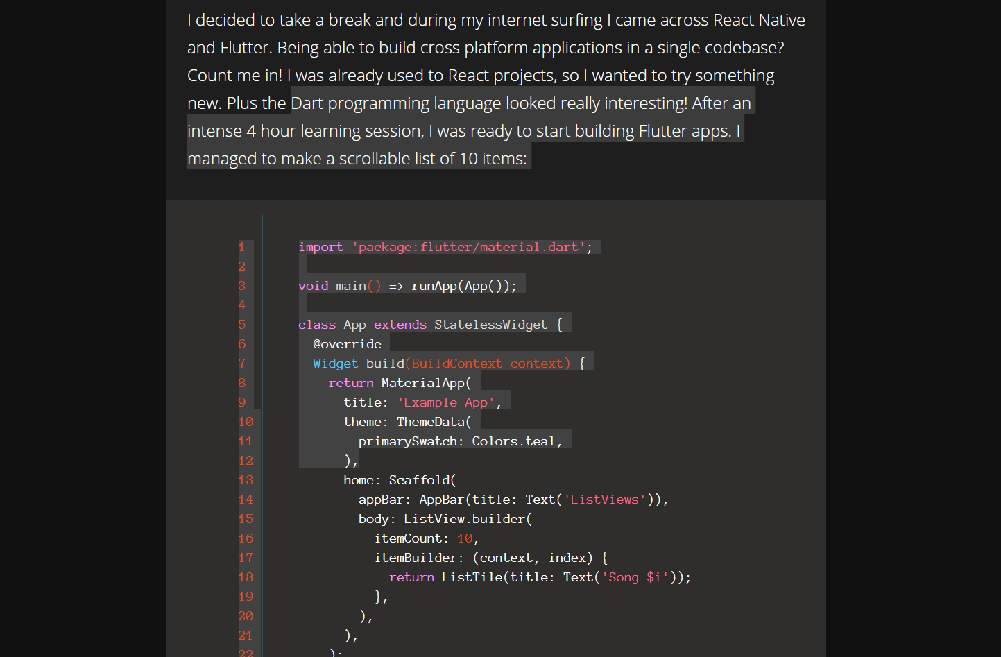
First thing I decided to change was the dark theme’s color pallete.

I thought the grays were a little too bright for my liking. A few minutes with the Material Design docs and some code refactoring later:

Now that’s a sexy looking dark theme!
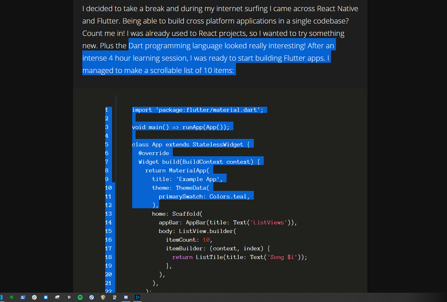
Next up, I was enjoying the new look of the site, but selecting text was giving me that default blue we’re all used to. I didn’t like the look, it was really killing the vibe I had going with my site, especially with selecting code snippets

As a newbie web dev, I thought to myself, “Can you actually change that…? Oh WOW, yes! Yes, you can!”

That feels much better. I think the look and feel of the site are matching up. There are a few things I would like to change, the side bar’s background color is doing its own thing. Also, the syntax highlighting of code snippets could use an upgrade as well.
Maybe for another post, I the past few hours today learning how the original author of the theme organized his code. I think now have a good idea where things are at and I’m feeling more confident changing things here and there without breaking the site.
I’ll be sure to add some more changes in the future!
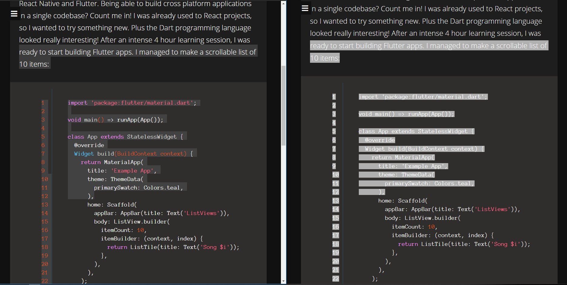
Edit: Oops, turns out the selection color looks different from Chrome to Firefox..

Welcome to Web Development
Supposedly, Chrome was adding a bit of transparancy to the color. Interesting, since checking out the styling from inspect element gave me the exact same color with no alpha:

The color seems to be more accurate in Firefox. I used the secondary text color for the selection color, and it matched up when I selected text using that color on the site. Cleary, Chrome added some transperancy.
PUN INTENDED
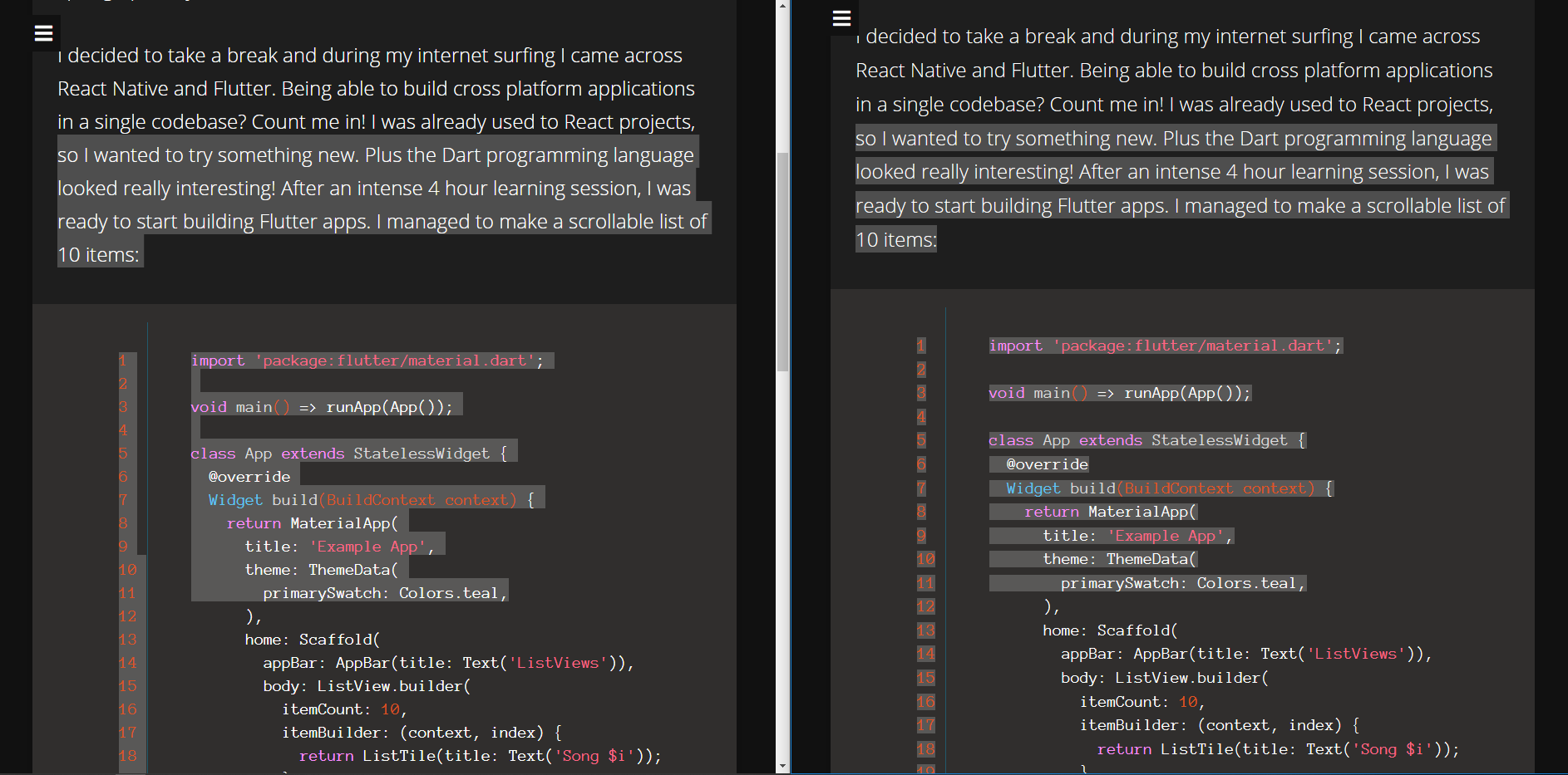
A bit odd, I might need to keep this in mind when selecting colors in the future. For now, I set the selection color to rgba(150, 150, 150, 0.4) which is rendering a more consistent look to the text selection coloring.

I’m not sure if this is by design or what, definitely going to have to do some more research on this.
- Jerry